Kindred Faeries: Brand & Website for a Queer Non-Profit
A warm, magical brand and single-page website for Kindred Faeries, a Dutch queer community forming as a stichting; built to welcome members, showcase gatherings, and present credibly to funders.
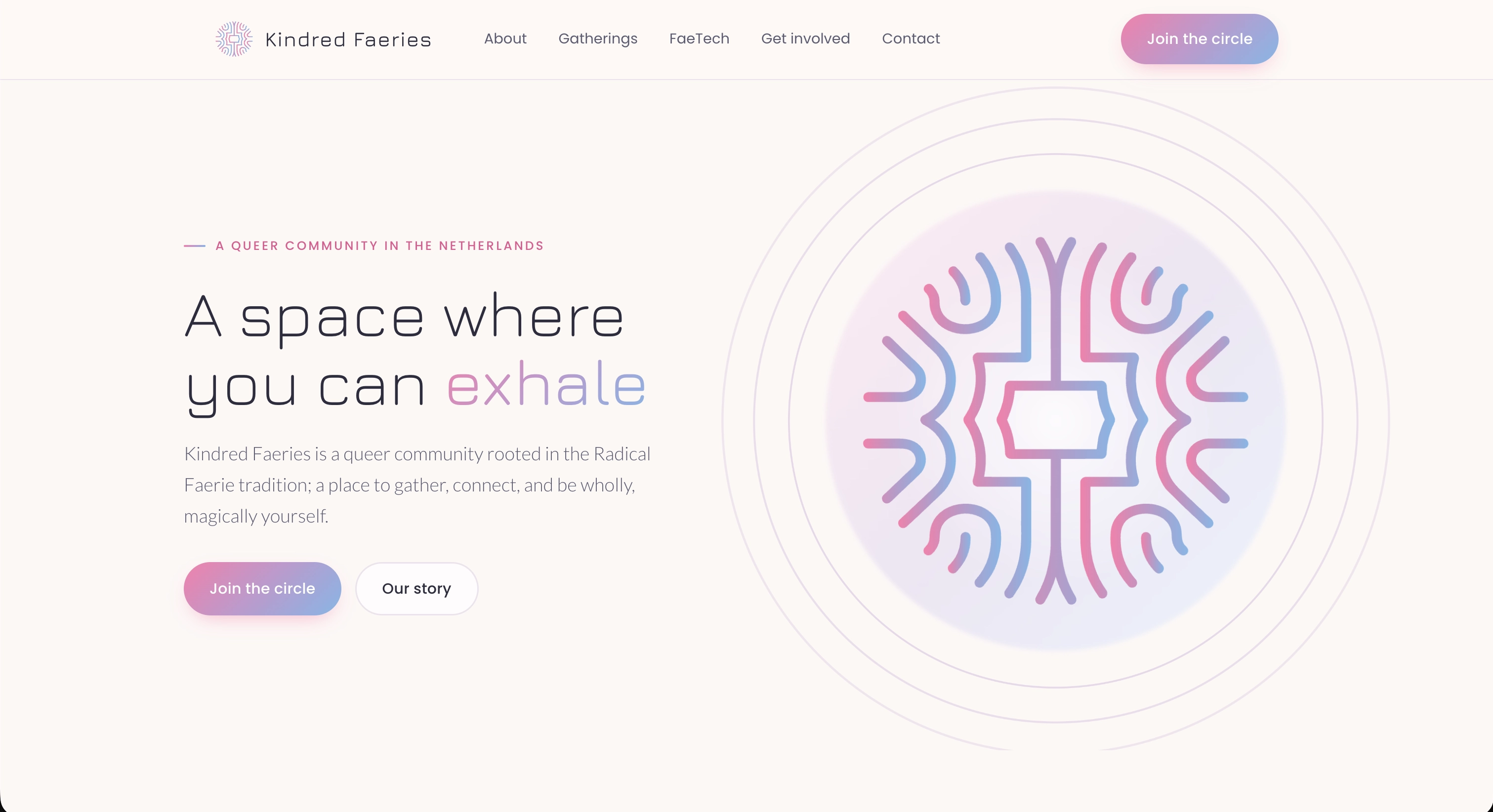
A Space Where You Can Exhale
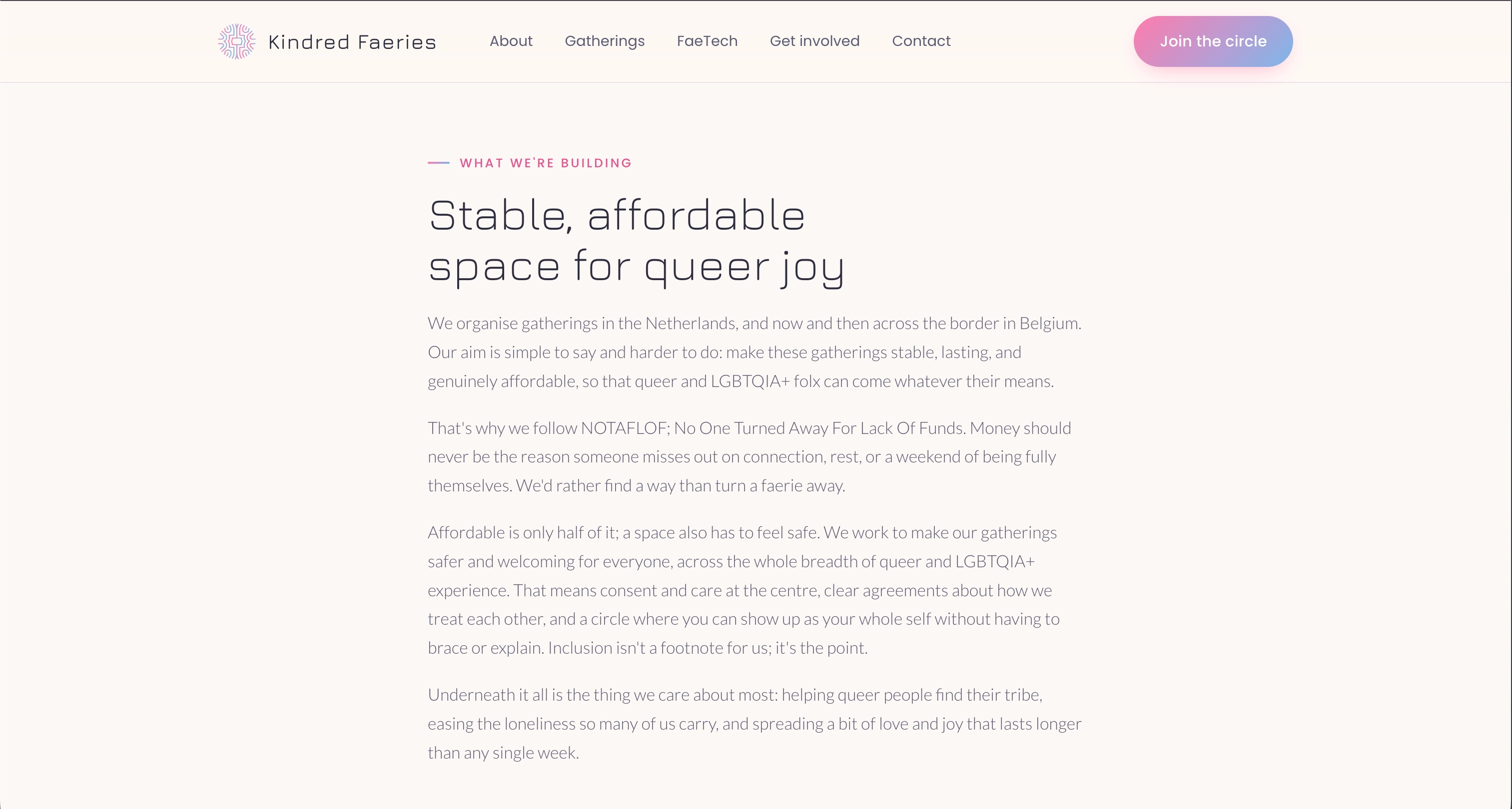
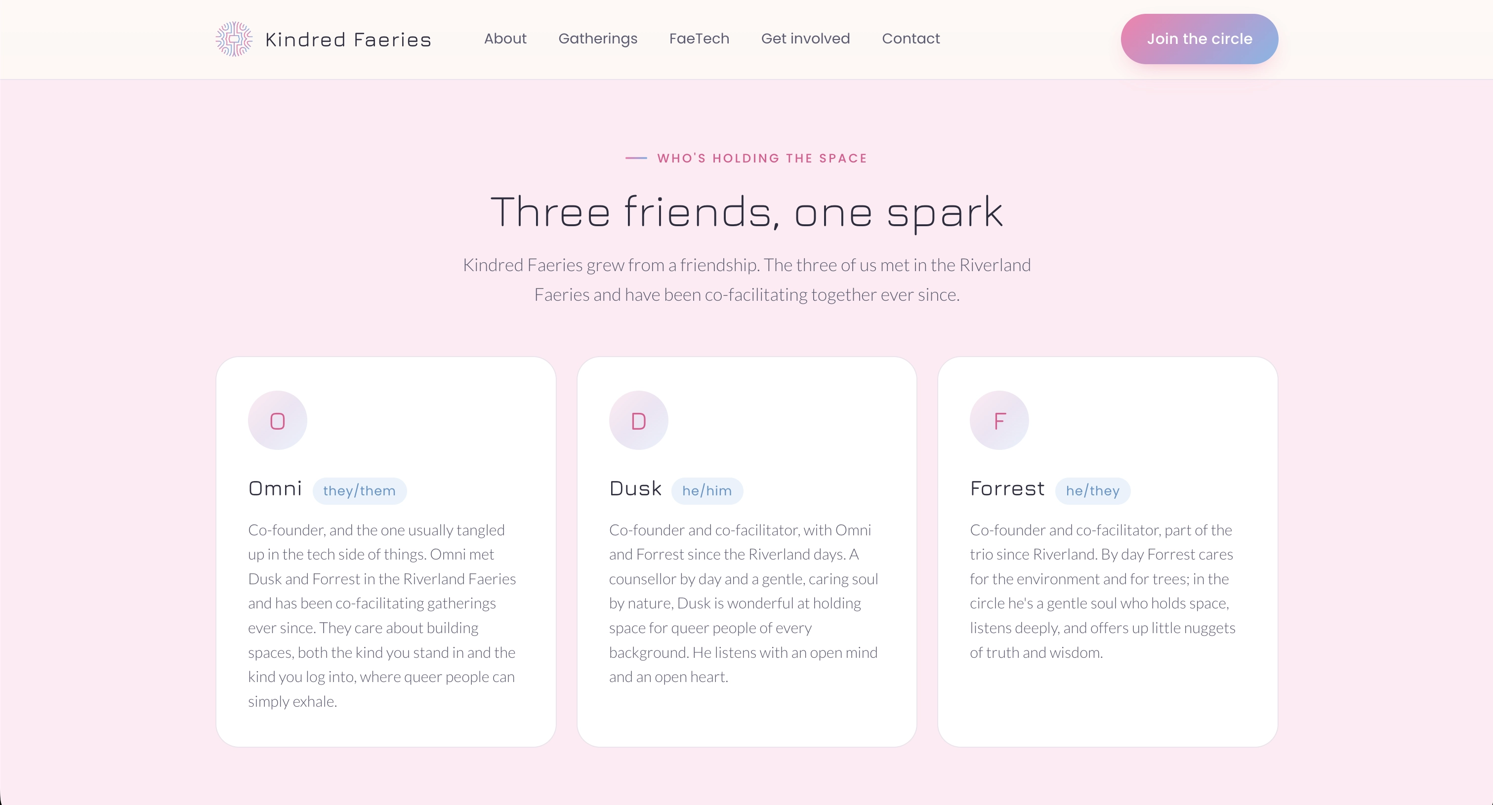
Kindred Faeries is a queer community in the Netherlands rooted in the Radical Faerie tradition; a place to gather, slow down, and be wholly, magically yourself. Founded by three friends who met co-facilitating gatherings in the Riverland Faeries, the group is now forming as a stichting (a Dutch non-profit foundation) so it can keep its gatherings stable, lasting, and genuinely affordable.
They needed a digital home that could do several things at once: welcome newcomers gently, point people to upcoming gatherings, show off the open-source community tools they're building, and present credibly enough to attract board members, facilitators, and funding. Drake Design Studio delivered the full brand and a single-page website to match.
Services Delivered
Brand Identity
- Mandala Logo Design
- Faerie-Pink Colour Palette
- Typography & Design System
- Warm, Inclusive Visual Language
- Values-Led Brand Voice
Website Design & Build
- Single-Page Narrative Site
- Anchored, Smooth-Scroll Navigation
- Responsive, Mobile-First Layout
- Gatherings & Team Sections
- Accessibility-First Approach
FaeTech Showcase
- YooHoo Social Feature
- Fae Social Preview
- Product Screenshots
- Clear Calls to Action
- Cross-Linking to Live Apps
Privacy & Conversion
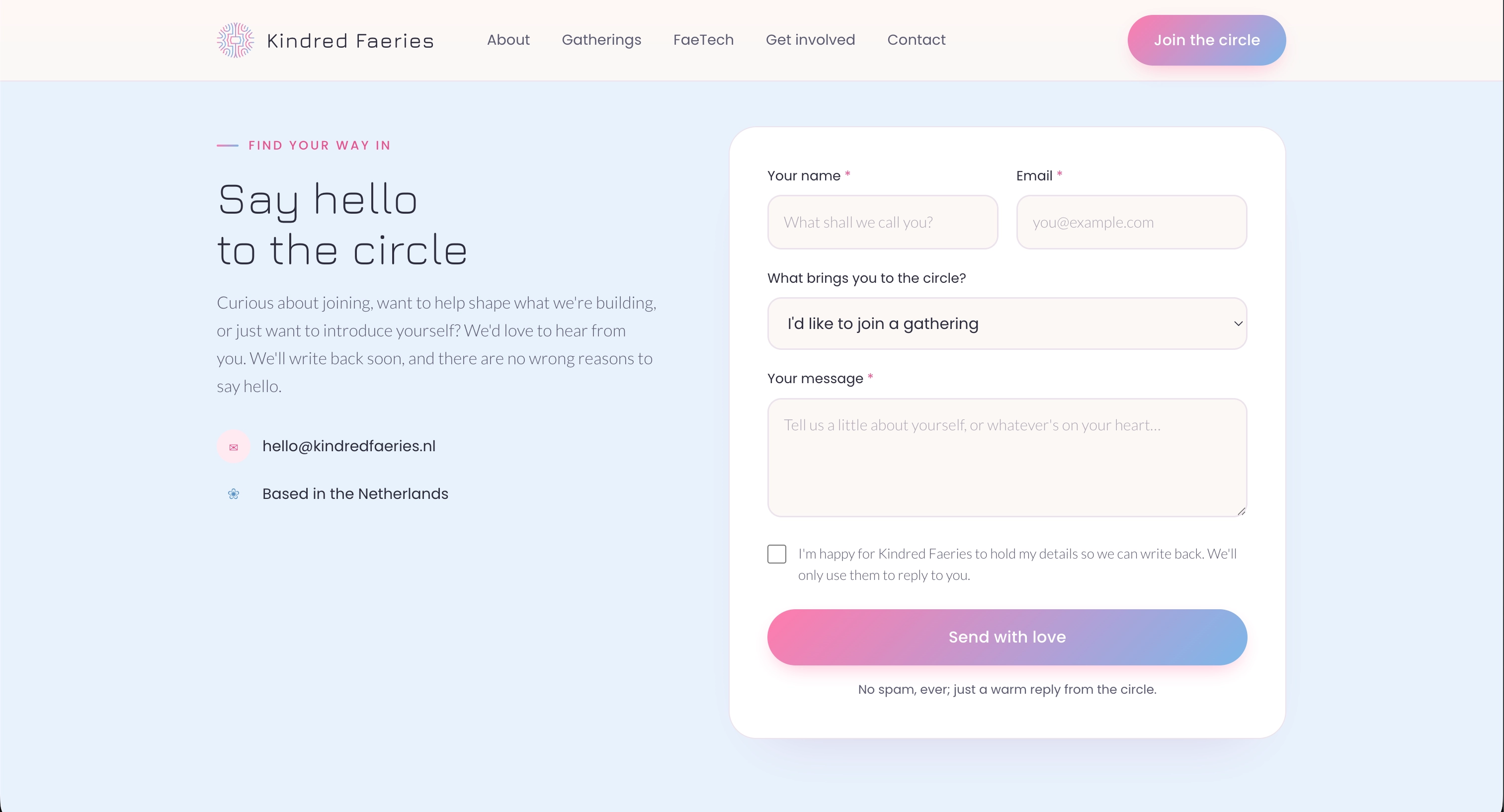
- Consent-Aware Contact Form
- Cookie Preference Centre
- GDPR-Compliant by Design
- Privacy & Cookie Pages
- Get-Involved Recruitment
The Challenge
Kindred Faeries had a clear spirit but no digital presence. As a stichting in oprichting (a foundation in the making), they needed a site that felt authentically Faerie; warm, tender, and a little mystical; while also reassuring potential board members and funders that this is a serious, well-intentioned organisation worth backing.
The site had to carry a lot: their story and values, a list of upcoming gatherings with registration links, introductions to the three co-founders, a showcase of the community tech they're building, and an open invitation for people to get involved. All of it needed to work on a phone, respect visitors' privacy, and never feel corporate or cold.
Our Approach
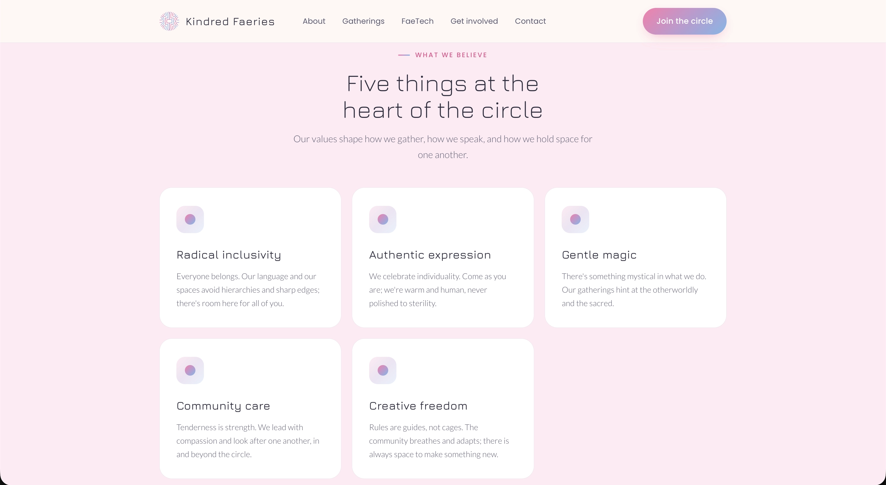
We built the identity around a mandala mark and a faerie-pink palette that balances whimsy with calm. The result is soft-edged and human, with a thread of the mystical running through it; an identity that signals safety and belonging the moment you arrive.
The website is a single, flowing page with smooth anchored navigation, so the whole story reads like one unhurried scroll: who they are, what they believe, where they'll meet next, the FaeTech tools, and how to help. We added a consent-aware contact form and a full cookie preference centre so the site is GDPR-compliant from the first visit, and designed every section to hold up beautifully on mobile.
The Outcome
A Brand That Feels Like a Welcome
The mandala mark and faerie-pink palette capture the community's tenderness and gentle magic, while still reading as considered and trustworthy. It's an identity that says "you belong here" before a single word is read.
A Recruitment Tool for the Stichting
Clear get-involved sections for board members, facilitators, comms, and developers turn the site into an active invitation, helping the founders build the team they need to stand the foundation up.
A Hub for Gatherings & Tech
Upcoming gatherings link straight through to registration, and the FaeTech section gives YooHoo Social and the forthcoming Fae Social a proper shop window, connecting the in-person circle to the tools that keep it together between meetings.
Private & Compliant by Default
A consent-aware contact form and a granular cookie preference centre mean the site respects visitors' data from the outset; a small but important signal of care for a community built on safety and trust.
Project Gallery