Radical Faeries of Europe: Brand Refresh & Digital Transformation
A complete rebrand and website redesign for the Radical Faeries of Europe, transforming their digital presence to support ANBI status and community growth.
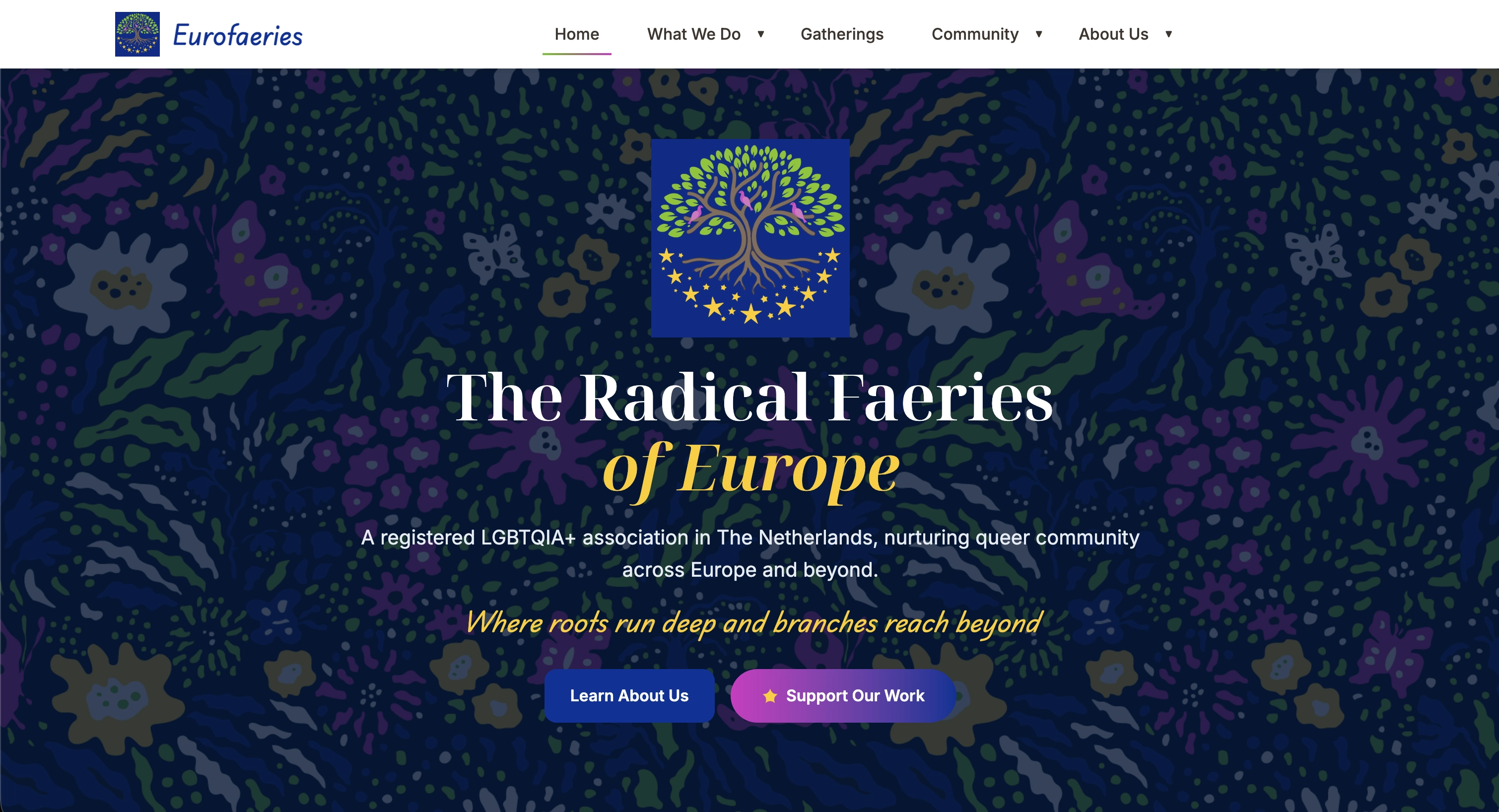
Where Roots Run Deep and Branches Reach Beyond
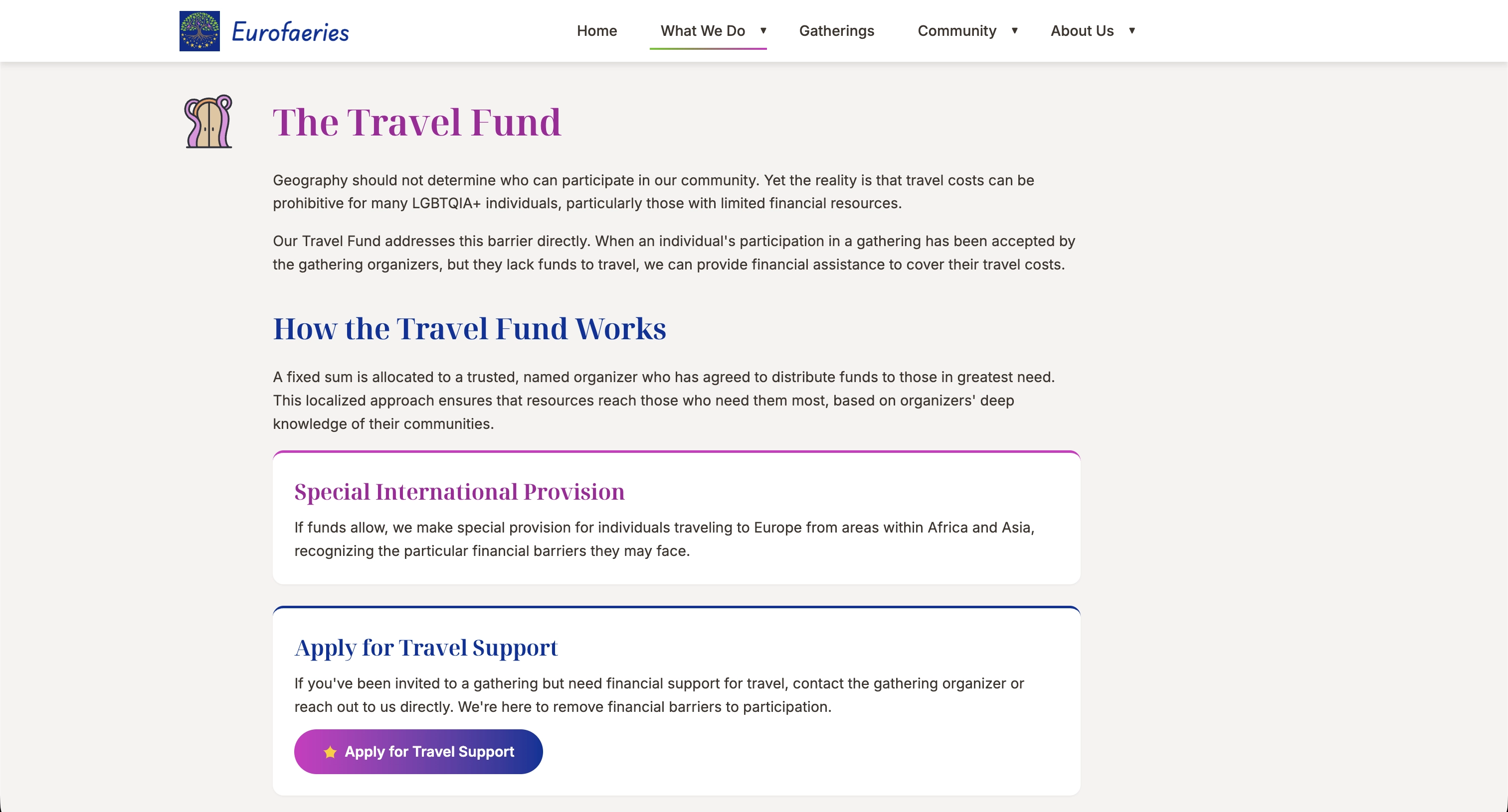
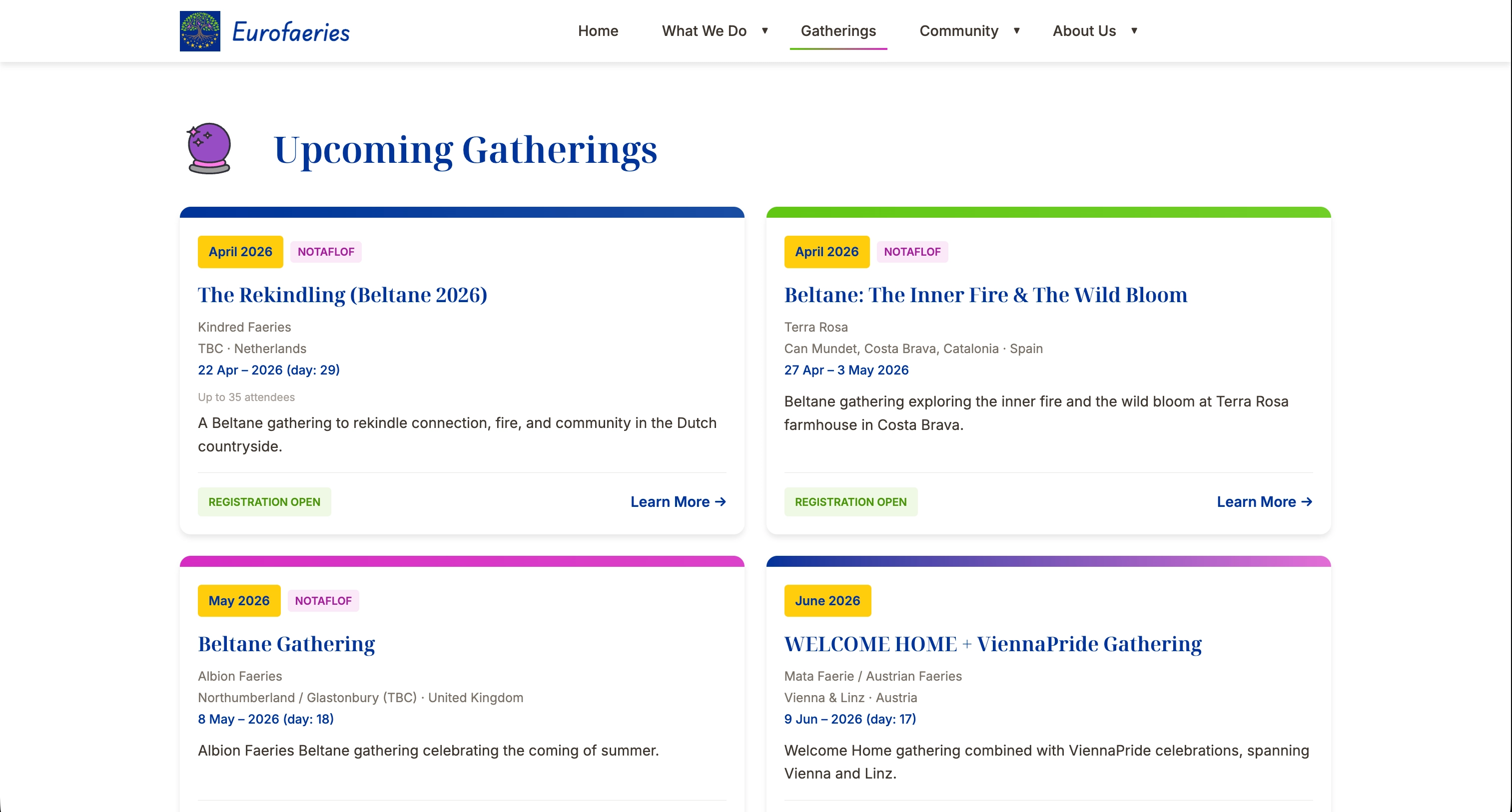
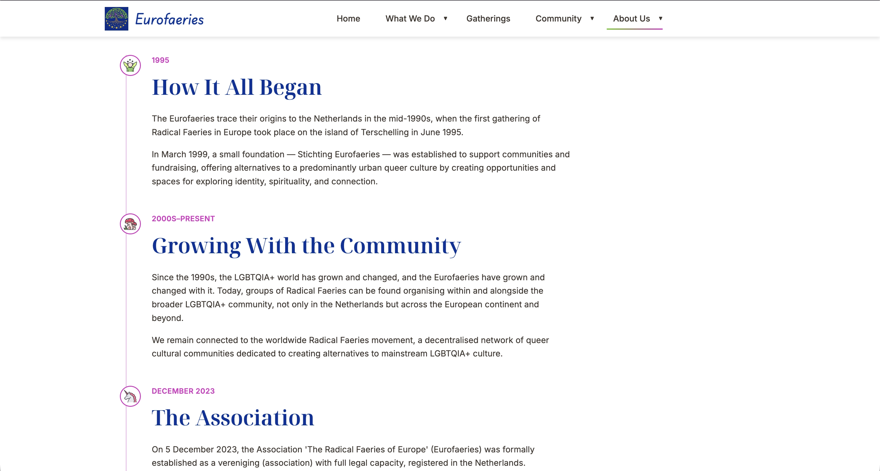
The Radical Faeries of Europe is a registered Dutch LGBTQIA+ association that nurtures queer community across Europe through gatherings, creative activities, and financial support. With programmes like gathering underwriting and a travel fund, they remove barriers to participation and make community accessible to all.
Their previous website had grown outdated, and the organisation was preparing to apply for ANBI status (a Dutch tax-exempt designation for public benefit organisations). They needed a brand and digital presence that reflected both their creative spirit and their credibility as a serious, well-governed non-profit. Drake Design Studio took on the full rebrand and website redesign.
Services Delivered
Brand Identity
- Logo Redesign
- Colour Theme Development
- Design System Creation
- Brand Guidelines Document
- Visual Identity Standards
Website Design & Build
- Complete Site Redesign
- Responsive Layout
- Interactive Navigation
- Dynamic Content Loading
- Accessibility-First Approach
Form Processing API
- Digital Application Forms
- Community Funding Requests
- Automated Processing
- Replacing Manual Word Docs
- Submission Management
ANBI Readiness
- Transparency Sections
- Governance Information
- Registration Details
- Financial Accountability
- Professional Credibility
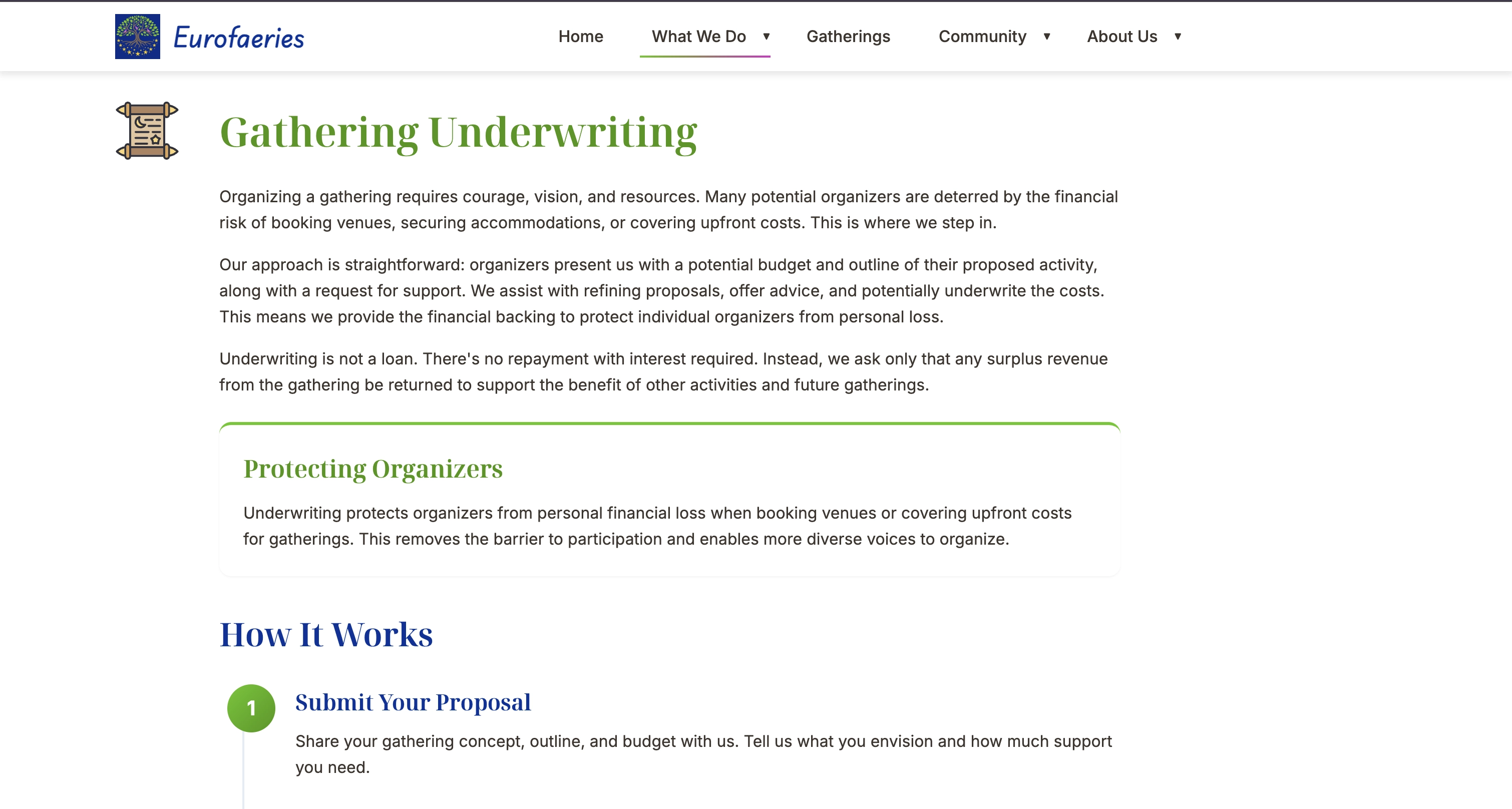
The Challenge
The Radical Faeries of Europe had an outdated website that didn't reflect the vibrancy or seriousness of the organisation. With their application for ANBI status on the horizon, they needed a digital presence that could demonstrate good governance and transparency to the Dutch tax authority (Belastingdienst), while still feeling authentically Faerie.
On top of that, their processes for handling community funding applications were entirely manual. Applicants had to download Word documents from the website, fill them out by hand, and send them back. This created friction for applicants and administrative overhead for volunteers.
Our Approach
We started with the brand itself. The logo was redesigned and a new colour palette was developed; deep blues, golden star tones, and faerie magenta; that balances whimsy with institutional credibility. A full design system and brand guidelines document ensures consistency across all future materials.
The website was rebuilt from scratch with clear sections for governance, programmes, community resources, and publications. We designed and built a form processing API that replaces the old Word document workflow, allowing community members to submit funding applications digitally. The result is a site that feels magical and inclusive, while clearly communicating that this is a well-run organisation worthy of ANBI recognition.
The Outcome
A Brand That Balances Spirit and Substance
The new visual identity captures the creative, inclusive spirit of the Faeries while presenting the professionalism required for ANBI status. The design system ensures consistency across all touchpoints.
ANBI-Ready Digital Presence
The website prominently features governance information, registration details, and financial transparency; all requirements for ANBI recognition by the Dutch Belastingdienst.
Digitised Application Process
The custom form processing API replaced a cumbersome manual workflow. Community members can now apply for gathering underwriting and travel funds entirely online, reducing friction and volunteer admin time.
A Living Community Hub
With dynamic content loading, interactive navigation, and sections for gatherings, resources, and publications, the site now serves as a true hub for Faerie community across Europe.
Project Gallery